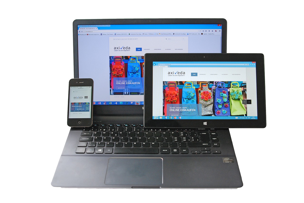
Do you always wonder how you can make your website mobile-friendly? Do you want your customers to always visit your website and wanting to come back? Let’s take you through the walk. Below are some tips you can make use of to make your website mobile friendly.
- Employ Frameworks
- Use Media Queries
- Make use of simple designs
- Use a mobile-friendly CMS theme
- Make use of Percentages
- Avoid the use of flash
- Optimization of Image Size
1. Employ Frameworks
For example, the Bootstrap front-end framework is designed to automatically scale a web page in a device. However, you must ensure the framework is fully compatible with the existing goals and site before proceeding.
2. Use Media Queries
As a media tool, the media query is vital. In this case, the customer selects the device size and the CSS (Cascading Style Sheets) set is delivered to the browser.
Assuring that the system is configured across all devices is critical. Subscriptions or cross-referencing lists help collect data.
3. Make use of simple designs
Simple design distinguishes the display from the desktop, making it more practical, and provides instant content delivery as expected by customers. Decent website design does not detract from valuable investment and absorbent nature.
4. Use a mobile-friendly CMS theme
For the users, these themes ensure a high-quality display and smoother website operation. Themes for mobile-friendly websites, publishing and content management should be used.
5. Make use of Percentages
Pictures are no longer scaled by pixels, resulting in a sloppy web appearance. In order to provide a good viewing experience for customers, it is important to keep all images at a specific width, typically 100%.
6. Avoid the use of flash
Do not cultivate the habit of using flashing, it simply interferes with website display. Instead of using flash, make use of HTML.
7. Optimization of Image Size
Keeping the image size smaller than the file size makes the website look crisper and cleaner for the customers. Reduced size also saves data, speeds up page loading, and gives the site a more professional look.